ASE Orange
#EA664A

ASE’s visual identity reflects a technology company that has grown through innovation, partnership and optimism since 1984.
ASE was born in 1984. Our smiling sun has twelve rays and represents the energy, warmth and optimism at the heart of our brand. The symbol has become a familiar signature for ASE people, places and technologies around the world.
The visual-identity system gives every team a consistent way to present ASE while leaving room for clear, contemporary communication across print and digital channels.
Updated 2023
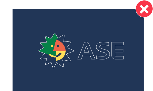
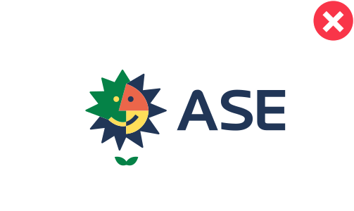
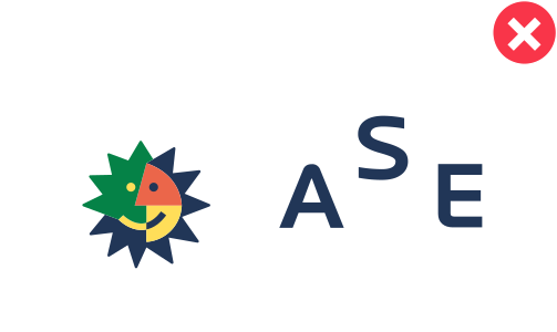
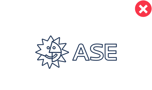
The ASE logo combines the sun symbol with a bold, stable wordmark. Its proportions, colors and spacing must remain unchanged. Use only approved artwork and never redraw, stretch or rearrange the elements.



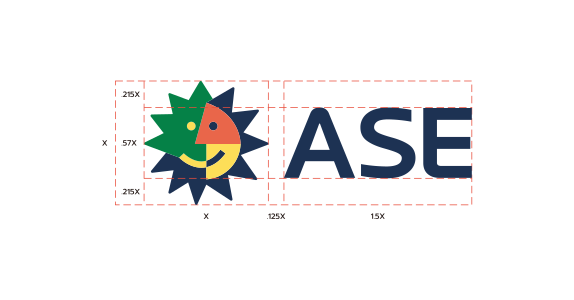
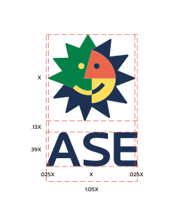
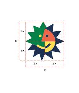
Maintain clear space around the logo so it remains distinct from text, photography and other graphic elements. Use the logo only where it can remain fully legible.


#EA664A
#1D3253
#FEDF58
#058247
#FFFFFF
#1E120E